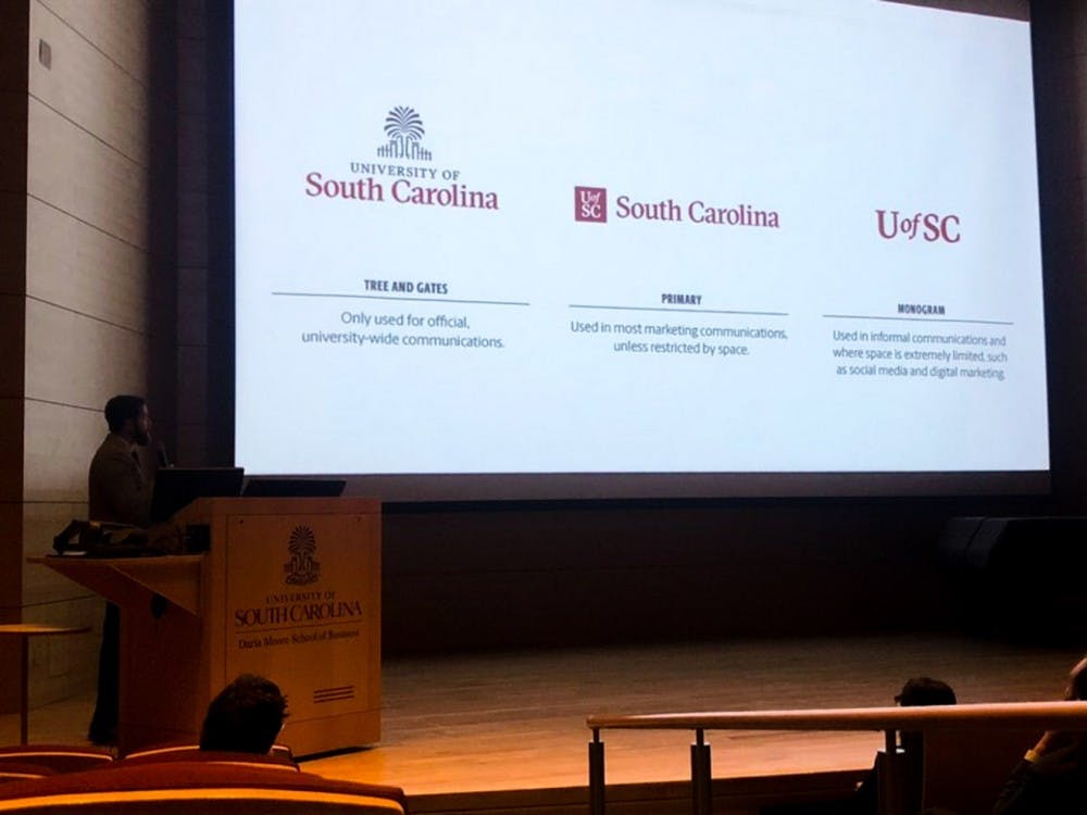
USC communications announced refreshed logos and a new brand strategy used in written and verbal communications at a Communicators Network meeting on Jan. 9. The new logos were also shared on official USC social media accounts.
The communications office introduced the previous USC logo with the palmetto tree and horseshoe gates in 1996 and refreshed it in 2011. The new logo removes “1801” from the bottom, removes a row of prongs from the tree and adapted the look of it for digital usage.
“It was introduced in ‘96 before social media, early in the days of the web, and so it really didn’t work well in digital spaces and so that was a big driver of this,” said USC director of brand strategy J.C. Huggins. “So as we more and more communicate in digital ways we needed a mark that was easily recognizable and carried some meaning with it.”
Not everyone is enthusiastic about the logo change, particularly the one bearing “UofSC” on social media.
“I don’t like it. I feel like it looks like something they made on Microsoft Word,” said fourth-year geography student Delone Cramer. “It’s very cheap, like they didn’t pay too much for it, like they did it themselves.”
The former brand campaign featured the tagline “No Limits” and was the first step in consolidating the message conveyed by communicators, digital content and print publications at USC. USC communications created the new brand strategy to give more flexibility to university communications.
“What we found with 'No Limits' was that it was really successful at providing some consistency where not a lot existed before, but it didn’t quite go far enough,” Huggins said. “We needed something that was as flexible and as comprehensive as the university is itself.”
Huggins’ team worked alongside Ologie, a marketing company in Columbus, Ohio, that specializes in purpose-driven brands such as universities, to refresh USC’s brand.
“It’s the common thread we can find between the Darla Moore School of Business or the arts and sciences college and even athletics,” said Ologie senior account manager Liz Porter on USC's brand strategy. “It’s really one of the highest level messages that bring us all together so that we are telling a consistent and distinct brand story.”
One change that coincided with the logo change was the shift to the university being referred to as “UofSC” officially. The confusion over whether USC meant University of South Carolina or University of Southern California was settled in a 2008 lawsuit that began the transition to Carolina being called UofSC. The university announced at the meeting that it will no longer use USC in communications.
“I like that part of it, because it differentiates us from USC in California,” Cramer said.
Even though the university will stop using USC, it is not asking students to switch to calling the university UofSC.
“So many people have it deeply ingrained in them that this place is and always will be USC, and that’s fine,” said Ologie creative director Kyle Kastranec. “If people want to start calling it UofSC and start to gain some equity in that name I would love to see that happen, but here this is more of an inward going out message.”
The website will be refreshed sometime in February as the communications team is trained in the new design elements and brand strategy so the national representation of the university is strengthened in the new year.
“Without an aim for a brand that keeps us aiming higher and moving forward then we don’t have a bigger picture to work towards,” Porter said.

